Who Approved This?
As marketers, designers and developers, we consider ourselves to be creative types.
We have a strong appreciation for daring ideas, and we’re willing to push the envelope a little for an exciting concept we think our clients will love.
We also understand the struggle to stand apart from the competition. To get noticed, sometimes you gotta do something a little “out there.” But when it all comes together in the end, few feelings are as satisfying as showing off your killer results after the naysayers doubted you.
On the other hand, not all ideas are as good as they might seem during your brainstorming session. In fact, some ideas are best left as bad inside jokes between you and your creative agency.
Unless, it seems, you are Chili’s.
I try to imagine how their big corporate ad approval process must work. Surely concepts are presented, discussed, reviewed and revised to provide maximum brand value. At some point along the line, a conversation must have taken place in the marketing department to discuss and approve this specific concept.
I picture the top decision makers of Chili’s gathered around a long conference table in their suits and ties, each feeling the weight of this critical Black Friday campaign. Maybe they had their doubts about this concept before, but upon seeing a slapped-together prototype, they must have looked each other in the eye, nodded and solemnly agreed: “This is it.”
Whoever those Mad Men are, I hope they’re satisfied with themselves.
Because, seriously –
Who approved this???
I’m struggling to find the right words to describe my complicated feelings toward this image. Translated into emojis, my roller coaster of reactions looks something like this:
😳🥵🙄😨🤯🌶🤘🤦♀️
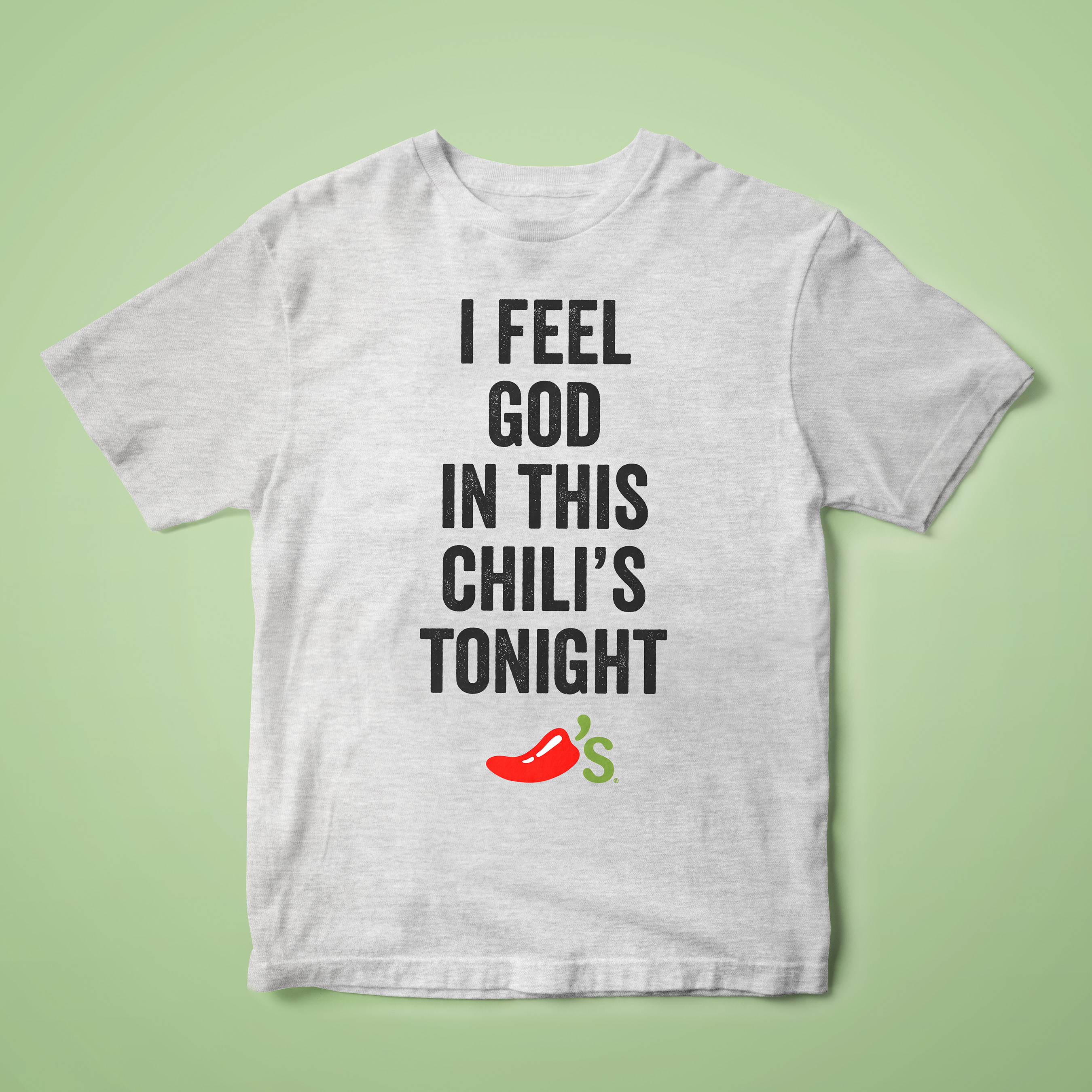
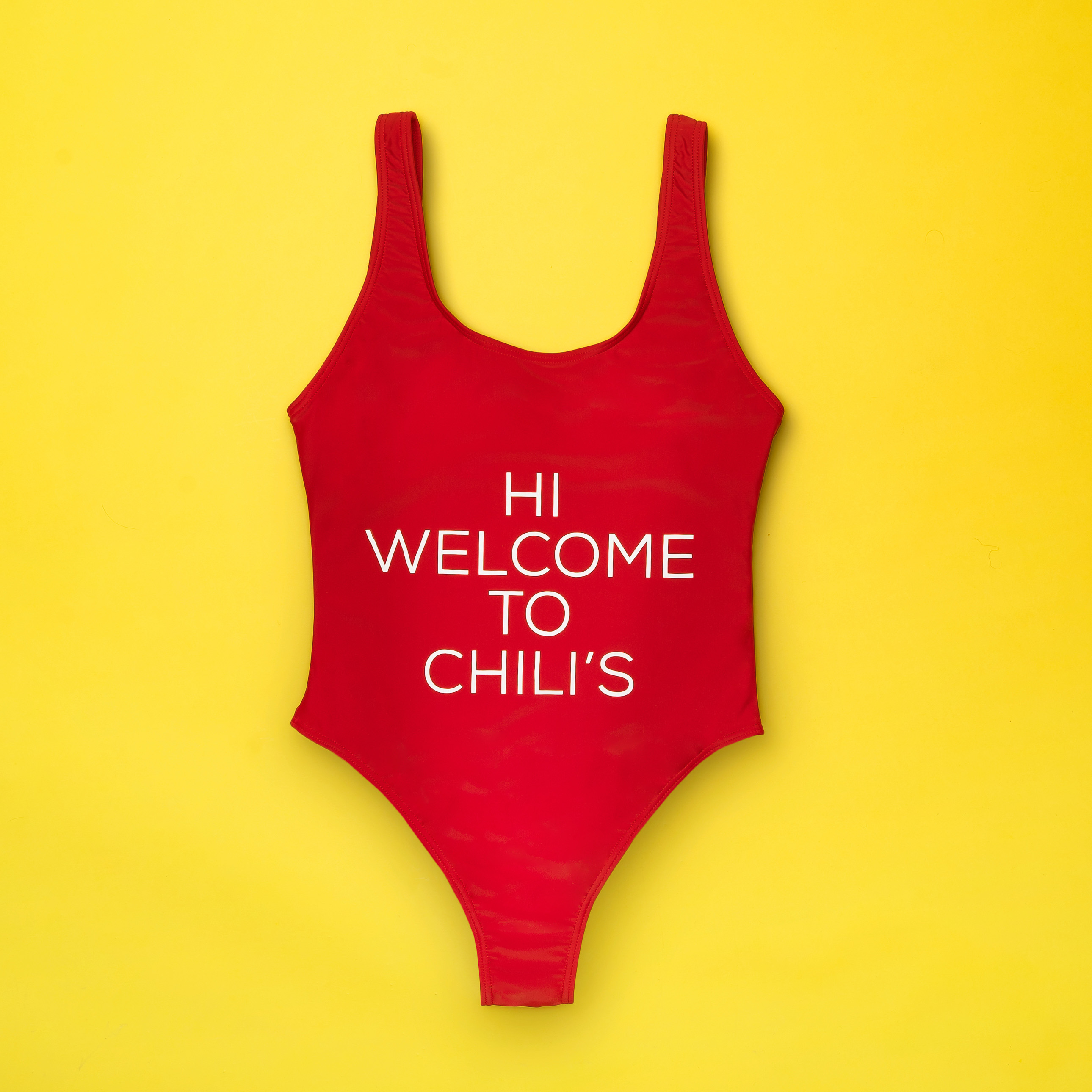
It’s also difficult to identify exactly what’s wrong with this product. Is it the off-brand font? The lack of the signature logo? The inclusion of the word “HI”? The inescapable visual of opening the restaurant’s heavy front doors and being greeted by a hostess rocking this Hooters-esque hot mess that hollers “HI WELCOME TO CHILI’S” so she doesn’t have to?
(Not sure why I assumed this would be worn by actual restaurant staff but, I mean, who else is it for? Would a regular woman wear this wannabe-Baywatch balderdash?)
This swimsuit is…wrong. It’s a knockoff piece of lycra you’d buy for $1 off wish.com. It’s maniacal merch madness. Branding gone bad. It’s too much, and it’s not even the only offering from this crappy capsule collection. (If you’re willing to risk your eyeballs, click here to view some more ill-conceived apparel from hell.)
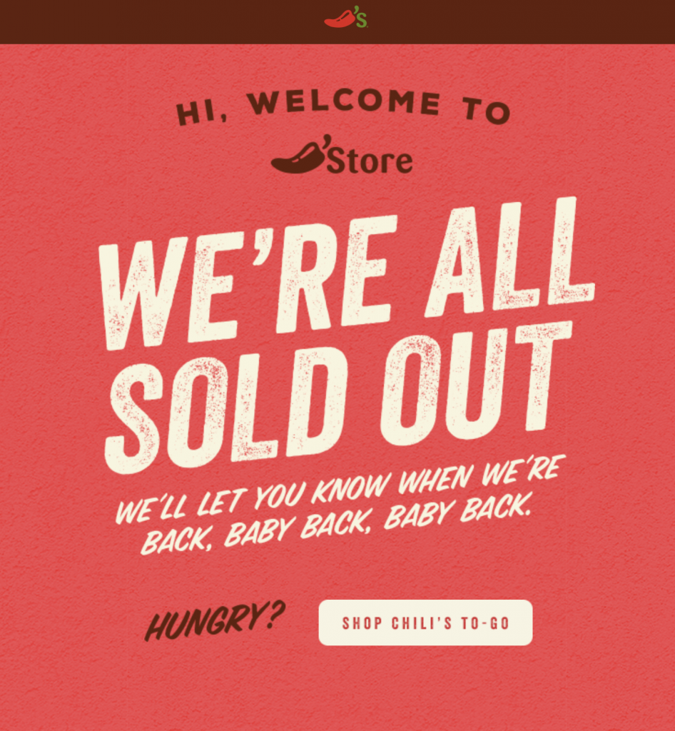
When I first stumbled upon an announcement for this Black Friday abomination, it wasn’t clear whether the landing page bearing this good news even knew it was in on the joke. But at the end of the day, clearly it doesn’t matter what I think of this idea, because Chili’s still killed it on Black Friday. Their store page clearly says so:
I have so many questions that I’m dying to ask the people who purchased those goods— who are you? But this message also struck me with confusion as to why the swimsuit didn’t use one of these brand standard fonts. Any of the above choices would’ve been an improvement over that strange sans serif that came out of nowhere.
If it were up to me, I’d nix all that weird text in favor of one spicy 🌶. Granted, I am not a clothing designer. But again, I ask:
Who approved this???
Perhaps there is a lesson we, as marketers, can take away from this cluster of a concept. I just wish I could tell you what that was.
Actually, now that I’ve calmed down a little, maybe it’s possible that this whole collection is brilliantly terrible and I’m just disappointed I didn’t snag this gem while I had the chance: