Responsible Responsive Design
It’s no mystery to anyone in 2017 that designing and building a website to be mobile-friendly is absolutely critical. With approximately 72% of Americans carrying a smartphone (according to Pew Research Center), it is generally understood that any and all websites must be easily navigable on mobile devices.
But just because a website can be viewed on a mobile device, does that mean that it is mobile-friendly? Is simply being “mobile-friendly” enough in 2017? With the proliferation of mobile device usage, shouldn’t all websites be “mobile-exceptional”? Let’s take a look at what that should mean:
1. Device Features
Nearly all smartphones have lots of bells and whistles to make using them a breeze. GPS, motion sensors, fingerprint sensors, and the list goes on. We should always use these device features when it makes sense.
For example: If you have a store locator feature on your website, you should geo-locate your user using the device’s GPS. This will make it faster and easier for them to find the location closest to them.
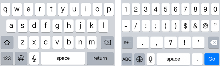
Another great example is if you have a form where you are asking the user to enter numeric data (such as a phone number, zip code, or quantity, it is helpful to program your form fields as numeric so smartphones will display the numeral-only keyboard. Or, if you’re asking for an email address, specify a type=”email” on the field so that mobile devices give the user an email-specific keyboard.
Using these device features will delight your users by making their mobile experience very user-friendly.
2. Content Hierarchy
Many studies have found that mobile visitors to websites have decidedly different usage needs and patterns. Let’s face it, users on both desktop and mobile just want to find the information they’re seeking so that they can get back to watching more cat videos. But, what they’re seeking may vary based on which device they’re using.
Knowing this, it is important to structure your site’s content hierarchy so that the most useful information is easy to find.
For example, if your business is a restaurant, you’ll want to make sure that your location, hours, and (easily viewable) menu are all very accessible on your site.
If you’re a service-based business (such as a landscaping company or a medical office), you’ll want to make sure that your contact information is prominently displayed as many visitors will simply want to call to set up an appointment or get information.
3. Performance
One of the most important factors in making a website “mobile-exceptional” is speed and performance. Even in today’s 4G LTE world, it is still critical to limit extraneous images, videos, and unnecessary content for mobile users. Or at least limit that kind of content to pages deeper in the site’s hierarchy so that it doesn’t slow down the user who is just trying to find location, hours, or a phone number.
And as always, don’t forget to use optimized images, responsive images, and compressed and minified javascript and css to make your site perform at its very best.
4. Overall Usability
Lastly, don’t forget to think about overall usability when it comes to your responsive website. Here are some quick usability tips:
- Keep in mind that visitors will be using their meaty little sausage paws to navigate your site. As such, you’ll want to make sure that you give them plenty large enough buttons and links and make sure all tappable elements aren’t too close to one another.
- Make sure that your site doesn’t rely on hover states for elements, since there’s no such thing as a “hover” on a mobile device.
- While you’re thinking about sizes of your elements, don’t forget to make font sizes large enough to be easily legible.
- And finally, even though it is (hopefully) common knowledge, you’ll want to avoid using any kind of Flash elements on your site.
We owe it to our mobile users to think critically and make sound decisions so that their user experience is the best it can be. Don’t just think about the base minimum that you need to make your site display nicely on mobile devices. Think about how you can enhance and make their user experience exceptional.
Need help improving your website’s mobile experience? We’d love to chat about what we can do to make your website more effective.
About the author:
Jeff Pollard
Partner, Director of Technology
Jeff is one of Torx's founding partners and serves as the agency's Director of Technology. He built his first website back in 1996 and has never looked back. Jeff wears many hats at Torx: front-end designer and developer, server administrator, and resident Apple enthusiast.