Common Design and Usability Misconceptions
Throughout the years we’ve come across numerous misconceptions about web design and usability. Hopefully we can put them to rest by offering some real data as to why they are simply wrong.
1. The Fold and “Users Don’t Scroll”
This is one of the biggest offenders, and one we run into quite often. The concept of the fold started in the early days of newspaper, where the top half of a folded newspaper was all that could be seen on the newsstand. This made it extremely important to make sure the content above the fold enticed a person to purchase the paper. During the early days of the web, the Nielson Norman Group conducted a study which concluded that users didn’t scroll, so it was key to put your important content at the top of the screen. A few years later in 1997, NNG retracted the statement citing that internet users had become acclimated to scrolling on the web.
There you have it, the people who conducted the actual study retracted their statement shortly after more and more people started hopping on the internet. In recent years more and more research has been performed which has uncovered some very interesting data. One study indicated that 66% of the attention of a user is spent lower on the page. Huge Inc also discovered that just about everybody scrolls, sometimes as soon as the page has loaded.
2. White Space is Unused Space
 Many people with limited design experience immediately see empty space and assume that it should be filled with something. That couldn’t be further from the truth. White space serves a very important purpose by separating content and providing much needed “breathing room.” You can even use extra white space to add emphasis or importance to content such as a large hero image or a call to action button.
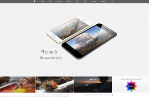
Apple demonstrates the concept of white space perfectly as their website always features the perfect balance of space around their product images. White space doesn’t have to be white; it can also be any color – the key is that you minimize content and only focus on what matters. Team Treehouse does an excellent job of using colored and non-colored white space to emphasize their content more. This also has the added benefit of making the site flow across all screen sizes and devices easier as well.
3. Web Design is Only About How a Site Looks
Having a website that looks great is very important, but looks mean nothing if the site itself is barely usable. Using all of the current design trends will matter very little when a user can’t access a portion of the website they need. When we are working with a client to design their site, we have to consider the demographics of the site’s visitors, how they will interact with the site, what types of devices they use and how they use them.
It’s also more important than ever that a website design looks good and functions properly across a multitude of devices. As much as 48% of the traffic on the internet is mobile, so it’s critical that your website works just as well on mobile phones and tablets as it does on a desktop.
4. A Website is Done After Launch
You just signed off for the launch of your new website and you may be thinking, “Finally, we’re done!” But guess again. Even with thoughtful planning, it’s difficult to predict how an audience will use a site before it’s been released into the wild. Anticipate that we may need to tweak and fine tune the final site down the road to ensure that your site can perform to its fullest potential. Sometimes this means making a button a little bit bigger, or trying out a few different lines of text to find the perfect message.
You should also plan to update your website’s content regularly. This matters from an SEO perspective because Google and other search engines like to see websites update often, which means that they’re relevant and have something to say. Sometimes doing an extra 1% more in terms of content and updates can help you get ahead of your competitor.
5. Everything Should Look the Same in Every Browser or Device
Many people think that once we build out a website design, it should look exactly the same in every browser, smartphone, and tablet. But with so many different devices and screen sizes accessing the web, that’s nearly impossible to do. This is especially true when dealing with older browsers, specifically Internet Explorer 8. Certain technologies only work in newer browsers, so we use a trick called progressive enhancement to ensure the most important content and design elements are visible for the oldest browsers, and newer technology improves the site as it becomes supported.
This may seem like a pain, but having this control and flexibility is actually a great strength of the internet and current tech. People can use assistive technology to make fonts on a website bigger, smaller phones allow us to view websites without having to lug around laptops, and ultimately your website becomes more accessible to a larger percentage of people.
6. I Want My Text Justified
 We typically type text in an alignment is known as rag-right, so that the lines are flush on the left side and then break to the new line without being flush on the right. Some people dislike seeing the unevenness that it creates and insist upon making the text justified, like how a newspaper looks with columns of text that are even on both sides.
The problem with justifying text is that it can cause all sorts of usability problems for people with various cognitive disabilities. In particular, people with dyslexia have an extremely hard time reading justified text because it creates a “river effect” where they cannot focus on the current line that they are on. On the other hand, this never happens with left or right aligned text, so it’s best to keep things simple and usable.
7. My Logo Should Be Way Bigger
Bigger isn’t always better, especially when it comes to your logo, but many clients want their logo to be much larger in the website design than we recommend. There are reasons why we don’t want the logo to take up as much space as possible, primarily because the logo is not the focus of the website. You have an ultimate goal for your site – sales, leads, etc., and the elements that support that goal should be the focus. A large logo can also impact the visual hierarchy or harmony of a design, and many people agree that it can come across as pretentious, so it’s best to use large logos only sparingly.
Look at any of the biggest websites on the internet – Facebook, Apple, or Amazon – and you’ll notice that the logos are small or almost non-existent. There are certainly some exceptions to those rules, primarily when you can use a subtle way to showcase your logo that blends in with the design.
8. The Website is for You
Your website is not for you, it’s for your potential customers. Even when we are building you a portfolio or company presence webpage, the website still really isn’t for you. It’s easy to get caught up in certain ideas and forget that the real goal is to sell a product or service to people on the other end of the internet. Many of the design decisions we make are determined by the types of people visiting your website, and then we mix in your personal brand to make your company stand out.
While they may be the biggest offenders, there are plenty of other misconceptions that even agencies sometimes overlook. Torx Media prides itself on being knowledgeable about usable design and development. If you are looking for someone to make a website that works effectively, contact us for a consultation.