Don’t Forget The Details: Designing Better Links
One of the most important aspects of the web – from the very start back in 1989 – was the inter-connectedness of it all. After all, it’s called the world wide web because it is all so connected. But even with its importance, unfortunately, the venerable HREF “a” tag doesn’t get much fanfare. So, let’s take a moment to examine some best practices for creating links on your website.
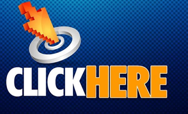
Resist the Urge To Use "Click Here"
 As simple as it may sound, using clear, descriptive link text is probably the most important aspect of creating a link. From a usability standpoint, your link should use meaningful text clearly communicating where the link is going to take the user. In other words, using things like “click here” and “follow this link” aren’t great for usability or ADA compliance. For example, instead of creating a sentence like this:
Complete our website survey by February 22 by clicking here.
Try making the link text more descriptive:
Please complete our website survey by February 22.
The more descriptive your link text is, the more comfortable your website visitors will feel about clicking the link. Another way to look at it is to imagine that the rest of the sentence is missing. If this was the case, would your link text be descriptive enough without the added context of the rest of the sentence?
Make Sure There's A Visual Difference Between Links and Regular Text
This goes back to one of the basic design principles of the Internet, but your links should always stand out in some way from the rest of your content. This could mean that the links are a different color, font-weight, or have an underline. The worst thing you can do is make your links look so similar to the rest of your content that your website visitors can’t tell what they should be clicking. Some clients ask us whether it is still a best practice to include an underline on all in-content links. In order to satisfy WCAG accessibility guidelines, your links should stand out in some way in addition to color. Because some of your website visitors may be color blind, your links should have some other distinction so that they can be easily seen.
A Hover State is a Great Idea
 As the above title states, having a hover state on your links is almost always a great idea. For desktop users, this provides positive feedback that they’re ready to click their mouse button. One technique we recommend against is changing the font size or font-weight on the hover state. The addition or removal of these style attributes can cause sporadic text/layout shifting and can make the surrounding text very difficult to read. Imagine reading a book and the words on the page keep moving around. Not a great user experience.
Make Calls To Action Stand Out
Lastly, you should always always always make your site’s calls to action stand out by formatting them to appear as a button. This virtually guarantees that your website visitors will pay attention to this button and increases the chances that they’ll want to click it. There’s an entire philosophy/discussion about button color theory I won’t discuss in this post, but just be aware that the color of your call to action buttons can have a subtle effect on how your website visitor feels about clicking them. And just like the rest of your site’s links, your buttons should also have a clear hover state that provides your visitors with positive reinforcement.
Most of these link creation tips may seem very basic. But we frequently see nicely designed sites that seem to have forgotten to follow these very basic guidelines. If you’d like our team to take a look at your site and provide our honest assessment, please get in contact with us (see what I did there?).
Let's Chat!
About the author:
Jeff Pollard
Partner, Director of Technology
Jeff is one of Torx's founding partners and serves as the agency's Director of Technology. He built his first website back in 1996 and has never looked back. Jeff wears many hats at Torx: front-end designer and developer, server administrator, and resident Apple enthusiast.